Tutorial 3: Graphs
Graphs: The art of designing information
Week of September 19, 2022
(3rd week of classes)
How the tutorials work
The DEADLINE for your report is always at the end of the tutorial.
The INSTRUCTIONS for this report is found at the end of the tutorial.
Students may be able after a while to complete their reports without attending the synchronous lab/tutorial sessions. That said, we highly recommend that you attend the tutorials as your TA is not responsible for assisting you with lab reports outside of the lab synchronous sections.
The REPORT INSTRUCTIONS (what you need to do to get the marks for this report) is found at the end of this tutorial.
Your TAs
Section 101 (Wednesday): 10:15-13:00 - John Williams (j.p.w@outlook.com)
Section 102 (Wednesday): 13:15-16:00 - Hammed Akande (hammed.akande@mail.mcgill.ca)
Section 103 (Friday): 10:15-13:00 - Michael Paulauskas (michael.paulauskas@mail.mcgill.ca)
Section 104 (Friday): 13:15-16:00 - Alexandra Engler (alexandra.engler@hotmail.fr)
General Information
Please read all the text; don’t skip anything. Tutorials are based on R exercises that are intended to make you practice running statistical analyses and interpret statistical analyses and results.
This tutorial will allow you to develop basic to intermediate skills in plotting in R. It was produced using code adapted from the book “The Analysis of Biological Data” (Chapter 2). Here, however, we provide additional details and features of many of the R graphic functions.
Note: Once you get used to R, things get much easier. Since this is your 3rd tutorial, try to remember to:
- set the working directory
- create a RStudio file
- enter commands as you work through the tutorial
- save the file (from time to time to avoid loosing it) and
- run the commands in the file to make sure they work.
- if you want to comment the code, make sure to start text with: # e.g., # this code is to calculate…
Intro video for tutorial 3 - recorded in 2020 so don’t follow report instructions if any is indicated in the video - follow the instructions here by Timothy Law (with input from the TA team)
General setup for the tutorial
A good way to work through is to have the tutorial opened in our WebBook and RStudio opened beside each other.
Bar graphs
1st bar graph
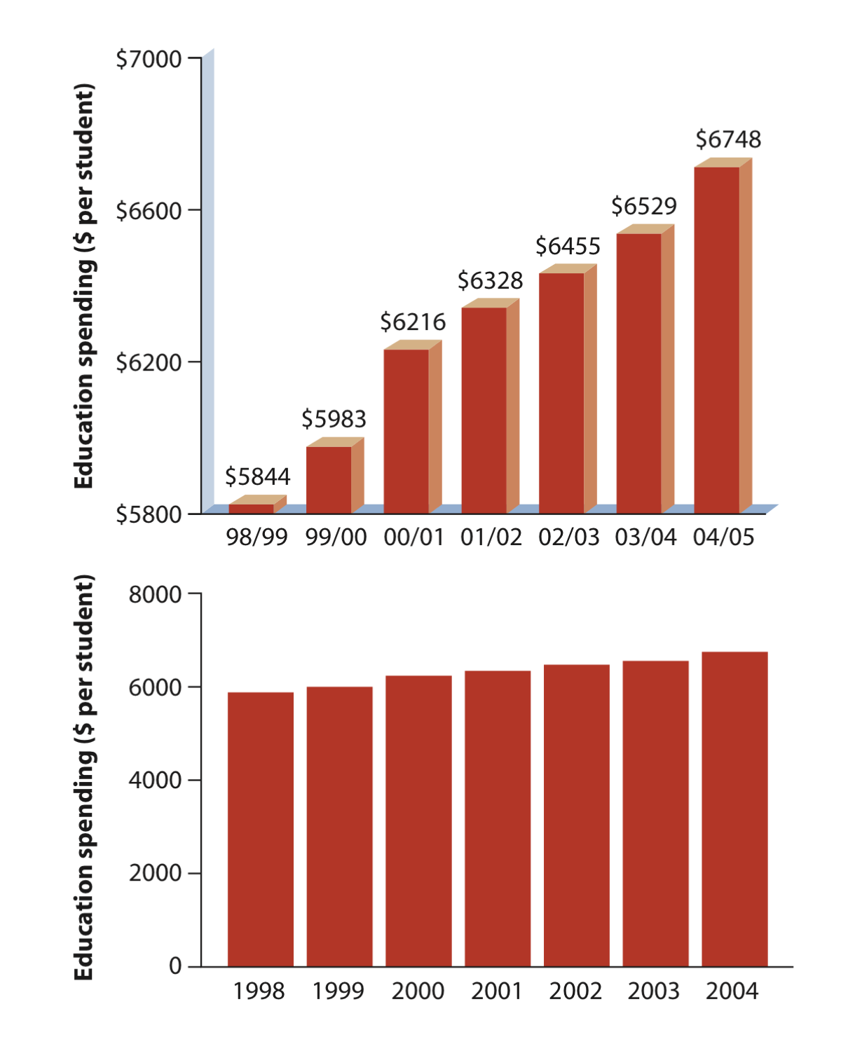
The simplest bar graph possible: This is the education spending data presented in our lecture 3. The data do not need to be summarized and all we will do it to plot the data spending in education through time.
Download the spending data file
Now open the csv file (e.g., in excel) and try to understand how the data are organized.
Now load the data in R as follows:
educationSpending <- read.csv("chap02f1_3EducationSpending.csv")
head(educationSpending)
View(educationSpending)
Remember that the function head plots the data for the first 6 observational units. As you noticed, data matrices are usually organized as having different variables as columns. So in the education spending data, variables year and spendindPerStudent are in two different columns. Again, there are several ways to access values in a particular variable (column) in a matrix separately, but the easiest is to use the $ (dollar) sign where the name of the data matrix preceeds the $ sign and the name of the variable of interest succeeds the $ sign. Type and run the code:
educationSpending$year
educationSpending$spendingPerStudent
To produce the barplot, then:
barplot(educationSpending$spendingPerStudent, names.arg = educationSpending$year)You will notice that the barplot produced is not as nice as the one in the Whithlock and Schluter book (see lecture 3) as below:
We can do much better by using and changing arguments within the function barplot as well as using other functions. Let’s start by adding the X-axis and Y-axis labels:
barplot(educationSpending$spendingPerStudent, names.arg = educationSpending$year,
        ylab = "Education spending ($ per student)",xlab = "year")
This is better but still not great! We will learn how to plot better in the next graph.
2nd bar graph
Influence of serotonin (“happy chemical) on the social behaviour of a desert locust (as seen in lecture 3). The data present the level of serotonin for each individual measured separately as a function of time (i.e., time is a manipulation treatment: amount of time that that particular individual was crowded together with others).
Download the seratonin data file
First open the file “chap02f1_2locustSerotonin.csv” in excel and try to understand how the data are organized.
Now load the data in R:
locustData <- read.csv("chap02f1_2locustSerotonin.csv")
View(locustData)
The bar graph is based on the mean values per treatment (control, 1 hour and 2 hours) as shown below:

Mean values per treatment can be calculated as follows:
mean.per.treatment<-aggregate(locustData$serotoninLevel,list(locustData$treatmentTime),mean)
mean.per.treatment
The function aggregate selected the data that belong to the same categorical value in a list (here Treatment, i.e., 0, 1 or 2) and applied a function on these values separately. Here we calculated the mean per treatment, hence mean as the third argument in the function aggregate; we can easily calculate the median by replacing mean by median as follows:
median.per.treatment<-aggregate(locustData$serotoninLevel,list(locustData$treatmentTime),median)
median.per.treatment
Let’s produce the bar graph based on the means:
barplot(mean.per.treatment$x, names.arg = mean.per.treatment$Group.1,xlab = "Time Treatment",ylab = "average seratonin (pmoles)")Note that the names of labels can be set as whatever you want but they should represent well the problem at hands.
Notice that the graph here is not as good as the one in the book (see lecture) . Let’s start by making the Y-axis vary between 0 and 12 as in the book so that the bar does not surpass the Y-axis as in the current version of the graph:
barplot(mean.per.treatment$x, names.arg = mean.per.treatment$Group.1,xlab = "Time Treatment",ylab = "average seratonin (pmoles)",ylim=c(0,12))Still needs some work though. Let’s change the colour of the bars:
barplot(mean.per.treatment$x, names.arg = mean.per.treatment$Group.1,xlab = "Time Treatment",ylab = "average seratonin (pmoles)", ylim=c(0,12),col="firebrick")There are different colour names for R plots. They can be found at: http://www.stat.columbia.edu/~tzheng/files/Rcolor.pdf
There is one last touch missing; the horizontal line under the bars; now it will look just like the one in the book; h is an argument in the function line that stands for horizontal.
abline(h=0)Obviously we don’t need to go through all this “typing” in separate steps; we could have done everthing by just entering one line of code, but it is easier to learn step by step while we are still R beginners:
barplot(mean.per.treatment$x, names.arg = mean.per.treatment$Group.1,xlab = "Time Treatment",ylab = "average seratonin (pmoles)",ylim=c(0,12),col="firebrick")
abline(h=0)
3rd bar graph
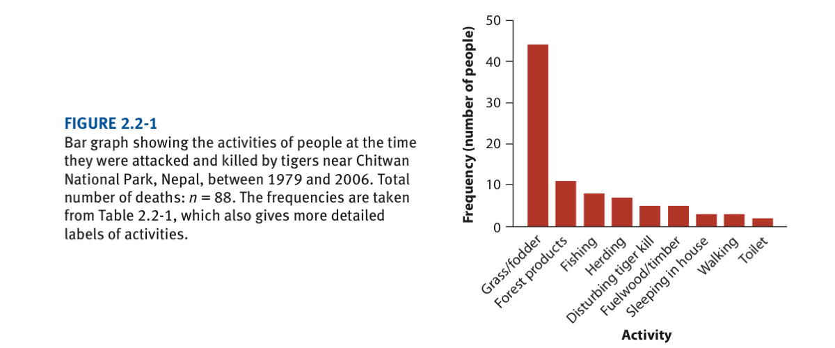
Death by tiger attack acccording to activities at the time they were attacked (see book Chapter 2 and/or lecture 3). The graph is as follows and we will try to reproduce it very closely:
Download the death by tiger data file
First open the file “chap02e2aDeathsFromTigers.csv” in excel and try to understand how the data are organized.
Now load the data in R:
tigerData <- read.csv("chap02e2aDeathsFromTigers.csv")
View(tigerData)
head(tigerData)
Note here that the data is in the form of the activity per person. Given that we want to present the number of people that were killed per activity, we need to calculate these values. The function table counts the number of times that each activity is recorded:
tigerTable <- table(tigerData$activity)
tigerTable
We should then order (sort) so that the bars go from the largest number of individuals to the smallest per activity:
sorted.tigerTable <- sort(tigerTable, decreasing = TRUE)
sorted.tigerTable
We could had performed the two operations above in one single line of code:
sorted.tigerTable <- sort(table(tigerData$activity), decreasing = TRUE)
sorted.tigerTable
Now let’s plot the bar graph:
barplot(sorted.tigerTable, ylab = "Frequency", cex.names = 1, las = 2)This graph has many issues, particularly we can’t read the X-labels (i.e., activities). So, we need to modify a number of arguments and introduce new commands regarding plot functions.
The first thing we need to know, is to change the plotting area. Function par allows one to enter graphic parameters. mar is an argument of the function par that allows to change the margin sizes of the plot region (i.e., bottom, left, top and rigth margins of the plot region).
par(mar=c(10,6,10,6))
barplot(sorted.tigerTable, ylab = "Frequency", cex.names =1, las = 2,ylim=c(0,50),xlab="activity")
When using graphic functions such as par, often other graphs are also affected; to reset R to its graphics default, we use the function dev.off() without any argument inside the parentheses, i.e., just ():
dev.off()Note that the X-label “activity” overlaps with the label of the X-axis so that we need to lower it. It is hard to know (memorize) all these arguments. One way is to use google search to find the information. Once you find it, organize it in a file so that you can have it handy (i.e., your own cheat sheet). Here is what could had been used as a search string in google to find the answer: “label barplot overlap R”. After looking at a couple of links, I found the answer at: https://rquicktips.wordpress.com/2012/10/05/how-do-i-prevent-my-tick-mark-labels-from-being-cut-off-and-running-into-the-x-label/
So, the function mtext (Write Text into the Margins of a Plot) does the trick as follows:
par(mar=c(10,6,10,6))
barplot(sorted.tigerTable, ylab = "Frequency", cex.names =1, las = 2,ylim=c(0,50),xlab="")
mtext(text="activity", side=1, line=8)
The final touch (at least for this graph in this tutorial), the line for the X-axis:
abline(h=0)We could play some more and perhaps change sizes of labels, rotate labels as in the graph version found in the book, colour of bars, etc. But we need to move over and you will learn about other functions and arguments along the way that will allow you to make your graphs look very elegant!
Reset graphics to its default parameters so that they won’t interfere:
dev.off()Histograms
Remember that a histogram is a graphical representation of a frequency distribution. By default, in R, histogram intervals are right-closed (left open) intervals. This can be changed but we won’t cover this ability here.
1st Histogram
Here we will use the data on the abundance of desert birds (Chapter 2)
Download the bird abundance data file
First open the file “chap02e2bDesertBirdAbundance.csv” in excel and try to understand how the data are organized.
Now load the data in R:
birdAbundanceData <- read.csv("chap02e2bDesertBirdAbundance.csv")
View(birdAbundanceData)
hist(birdAbundanceData$abundance)
This looks quite crude compared to the one in the book:

But we will learn how to make it look better in the next example:
2nd Histogram
Here we will use the data on body mass (Kg) of 228 female sockey salmon introduced in lecture 4 to produce the following histogram:

First open the file “chap02f2_5SalmonBodySize.csv” in excel and try to understand how the data are organized.
Now load the data in R:
salmonSizeData <- read.csv("chap02f2_5SalmonBodySize.csv")
head(salmonSizeData)
In the original histogram found in the book (shown above), you will notice that the X-axis vary from 1.0 to 4.0 kg; to follow this format, we need to fix the limits of the X-axis and change the by how much (say by 0.1kg or 0.3kg) body mass classes change. This will establish the number of breaks and keep the limits of the X-axis equal between different histograms having different number of body size classes. This is done by using the function seq in the argument breaks in the function hist. Try one histogram at the time
hist(salmonSizeData$massKg, breaks = seq(1,4,by=0.1), col = "firebrick",xlab="Body mass (kg)")
hist(salmonSizeData$massKg, breaks = seq(1,4,by=0.3), col = "firebrick",xlab="Body mass (kg)")
hist(salmonSizeData$massKg, breaks = seq(1,4,by=0.5), col = "firebrick",xlab="Body mass (kg)")
Before making one of this histograms look even better, let’s see what the function seq does. When using as an argument for the “break” in the function hist, it establishes the classes, here using 0.1, classes will be:
seq(1,4,by=0.1)In this way it will count how many individuals have a body mass between 1.0 and 1.1., between 1.1 and 1.2, and so on until count the number of individuals between 3.9 and 4.0
Let’s choose one of the histograms and make it look better.
hist(salmonSizeData$massKg, breaks = seq(1,4,by=0.3), col = "firebrick",xlab="Body mass (kg)",main="")
abline(h=0)
Scatter plots
Last week (tutorial 2) we saw one way in which the function plot works:
x<-1:7
y<-11:17
plot(x,y)
Another way that we adopt in this tutorial is:
plot(y~x)The first thing to notice is that both forms produce exactly the same graph. The second thing to notice is that whereas in the first form, x appears first and y appears second separarated by a comma, in the second form y appears first instead of x and they are linked by a tilda. In R, ~ signifies that y is being graphed as a function of x so that there is some sort of formal link (“dependency”) implied between x and y.
Let’s work on a real example now. Here we will use the data on the relationship between the ornamentation of male guppies and the average attractiveness of their sons (Page 42). The original graph (in the book) is as follows:

Download ornamentation data file
First open the file “chap02e3bGuppyFatherSonAttractiveness.csv” in excel and try to understand how the data are organized. Here, the average attractivness per individual (sons) have already been calculated (n=36) and are the values found in the csv file.
Now load the data in R:
guppyFatherSonData <- read.csv("chap02e3bGuppyFatherSonAttractiveness.csv")
View(guppyFatherSonData)
plot(sonAttractiveness ~ fatherOrnamentation, data = guppyFatherSonData)Note then that we are implying here the dependence between the attractiveness of sons (y) and how their fathers are ornamented (x).
The standard plot doesn’t look great. Let’s make it look better using the following steps:
- Make the dots solid:
plot(sonAttractiveness ~ fatherOrnamentation, data = guppyFatherSonData,pch=16)This link shows the codes for all plot symbols (argument pch). Look under “Plotting Symbols” - the number besides each symbol refers to the pch value: http://www.statmethods.net/advgraphs/parameters.html
- Change the colors of the dots:
plot(sonAttractiveness ~ fatherOrnamentation, data = guppyFatherSonData,pch=16,col="firebrick")- Change the labels of the X-axis and Y-axis:
plot(sonAttractiveness ~ fatherOrnamentation, data = guppyFatherSonData,pch=16,col="firebrick",xlab="Father's ornamentation",ylab="Sons's attractiveness")- Change the scales to match the one used in the book (Page 42)
plot(sonAttractiveness ~ fatherOrnamentation, data = guppyFatherSonData,pch=16,col="firebrick",xlab="Father's ornamentation",ylab="Sons's attractiveness",xlim=c(0,1.2),ylim=c(-0.5,1.5))- Finally, remove the box leaving only the 2 axes; As before, one can find this sort of information by searching on the internet. I used the search string “join x and y axis plot R” and found the link https://stackoverflow.com/questions/10874318/r-plot-x-axis-and-y-axis-touching; in there you discover that all you need to do is to set argument bty=‘L’…and voilà!
plot(sonAttractiveness ~ fatherOrnamentation, data = guppyFatherSonData,pch=16,col="firebrick",xlab="Father's ornamentation",ylab="Sons's attractiveness",xlim=c(0,1.2),ylim=c(-0.5,1.5),bty='L')Obviously, the last plot with all the arguments would had produced the desired graph. But, as before, by introducing arguments in steps the different arguments in the function plot helps you understand their characteristics.
Line graphs
Here we will use the temporal data on number of new measles cases through time (book, Chapter 3 and/or lecture 3). The original graph (from the book) looks like:

Download the Measles data file
First open the file “chap02e4aMeaslesOutbreaks.csv” in excel and try to understand how the data are organized.
Now load the data in R:
measlesData <- read.csv("chap02e4aMeaslesOutbreaks.csv")
View(measlesData)
Plot:
plot(confirmedCases ~ yearByQuarter, data = measlesData,xlab="Year",ylab="Number of new measles cases")
lines(confirmedCases ~ yearByQuarter,data = measlesData)
Let’s make it look better; change to solid (pch=16) coloured circles (col=“firebrick”). Again, colour codes for R can be at found at: http://www.stat.columbia.edu/~tzheng/files/Rcolor.pdf
plot(confirmedCases ~ yearByQuarter,data = measlesData,xlab="Year",ylab="Number of new measles cases",pch=16,col="firebrick")
lines(confirmedCases ~ yearByQuarter,data = measlesData)
Circles are a bit bigger in relation to the book, let’s make them smaller; not it may not look great in the RStudio graph window, but try to Zoom it and you will see how great it looks.
plot(confirmedCases ~ yearByQuarter,data = measlesData,xlab="Year",ylab="Number of new measles cases",pch=16,col="firebrick",cex=0.7)
lines(confirmedCases ~ yearByQuarter,data = measlesData)
Grouped bar graphs
Here we have two categorical variables and one numerical. We will use the data reporting reproductive effort and malaria described in chapter 3 (and/or lecture 3). The two categorical variables are the explanatory variable: treatment (control and egg removal) and the response variable: incidence of malaria (yes/no).
Download the bird malaria data file
The numerical values being plotted is the frequency of birds accross the combination of these two categorical variables
birdMalariaData <- read.csv("chap02e3aBirdMalaria.csv")
View(birdMalariaData)
We need to first count how many birds in each of the four combinations of the two categorical variables (Malaria/control, Malaria/egg removal, No Malaria/control, No Malaria/egg removal). The function table can be used for that:
birdMalariaTable <- table(birdMalariaData$response, birdMalariaData$treatment)
birdMalariaTable
Now, let’s produce the graph:
barplot(as.matrix(birdMalariaTable), beside = TRUE,col=c("firebrick","orange"))Now the graph with lots of arguments to make it very similar to the book…argrhhh…this is a big and very detailed code! At this point, it will be difficult for you to understand all the arguments and details. But you will understand them in the future if you invest time in R and in our tutorials. The point we want to make here is that you can do lots with R, including very nice graphs; but you have to put the time! But it’s worth it! They are kept forever in your code; even after years! One way to learn what the arguments do, is to change their values one at the time and see what happens when you re-do the graph. By having the code written, you can modify the code as much as you want to.
The plot may not fit in your RStudio screen and an error “Error in plot.new() : figure margins too large” may show up. In this case, change the size of plot window in RStudio by shifting their outter boarders using the mouse.
barplot(as.matrix(birdMalariaTable),
     beside = TRUE,
     col = c("firebrick","orange"),
     legend.text = c("Malaria", "No Malaria"),
     ylab = "Relative frequency",
     space = c(0.2, 1),
     args.legend = list (x = "bottomright", bty = "n", fill = c("firebrick", "orange"),
     inset = c(0, 0.8),
     xpd = TRUE, border=NA),
     ylim=c(0,30),
     border=NA) # end of entering all arguments for the function barplot
abline (h=0)
Mosaic plot for the Malaria data. Note that we transpose the table (i.e., birdMalariaTable) using the function t which stands for transpose.
mosaicplot(t(birdMalariaTable),
           col = c("firebrick", "goldenrod1"),
           sub = "Treatment",
           ylab = "Relative frequency",
           cex.axis = 1.1,
           main = "")
See what happens when you remove t above. You will notice that the variables will change place and it is not so easy to interpret the results.
Report instructions
Describe a fictional biological problem (e.g., an experiment you created) that can be plotted as a mosaicplot. Describe what are the response and predictor variable (and their units). Make up a data set (make up numbers) for your fictional problem and place them in a csv file. You can use excel and then save it in csv format.
Then create R code where the data files is read and the plot is produced. Everything should be done within an R script file. You can describe your fictional problem using # to comment the code; for example:
# I set up a study that .....
# use as many lines as necessary,
# always starting with  #
We have a lot of experience with tutorials and they are designed so that students can complete them at the end to the tutorial in question. Submit the RStudio file and the relevant csv file via Moodle. No written report (e.g., in a word file) is necessary.